

The room card that glows in the color of your lights. Area-aware · auto-discovering · fully UI-configurable · zero dependencies
| Badge variant | Chip variant |
|---|---|
 |
 |
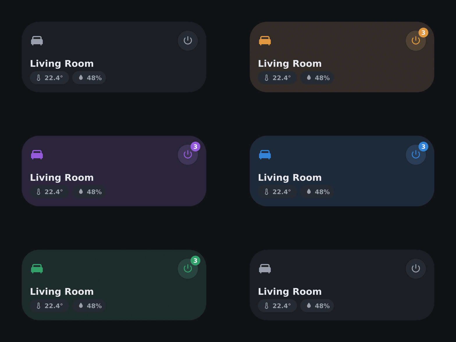
Warm evening light? Warm card. Purple gaming setup? Purple card. The previews use a high-contrast light background for consistent rendering.
- 🪄 Auto-discovery – pick an area, done. The editor pre-fills the light (group preferred) and temperature / humidity / CO2 sensors on its own.
- 🎨 Light-color accent – the card computes the average RGB color of all active lights and tints icon, background, power button and badge with it.
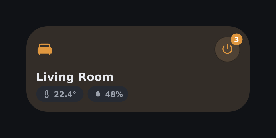
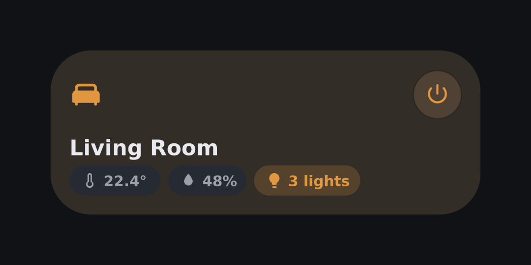
- 🔘 Power button with counter badge – toggles the room's lights, the badge shows how many are on. Own configurable action.
- 🌡️ Sensor chips – temperature, humidity and CO2 with identifying icons. CO2 turns amber at 1000 ppm and red at 1500 ppm. The row scrolls horizontally when it gets too wide.
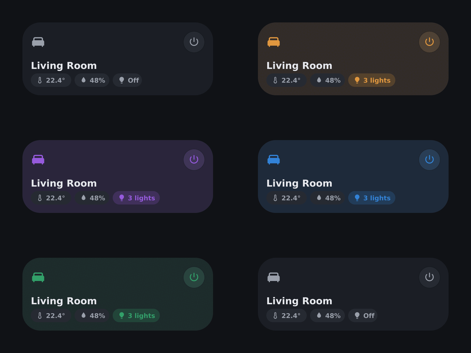
↕️ Sortable chips – arrange the chip order per card with arrow buttons.- 🃏 Three layout variants – counter badge, lights chip, or plain.
- 🖌️ Theme-adaptive – corner radius, border and shadow follow the active theme unless explicitly configured.
- 👆 Native HA actions – tap / hold / double-tap for the card plus a separate action for the power button.
- 🖥️ Full visual editor – area picker, filtered entity pickers, design sliders, reset button, live preview. Zero YAML required.
- 🌍 i18n – English & German, auto-detected from the user profile.
- ⚡ Vanilla JavaScript – no build step, no dependencies, one file.
badge (default) |
chip |
pur |
|---|---|---|
 |
 |
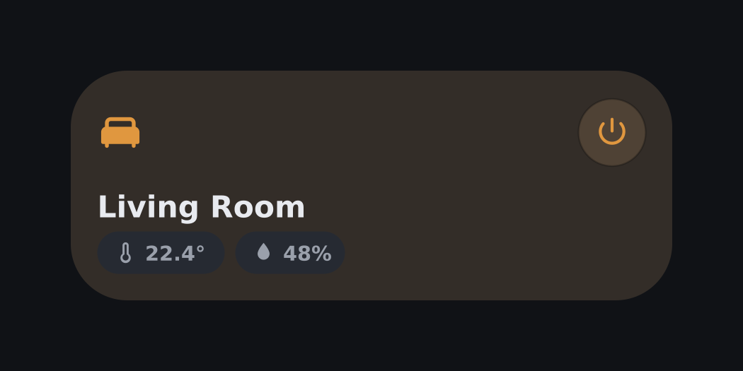 |
| Counter badge on the power button | Lights chip in the status row | No counter at all |
Or manually: HACS → ⋮ → Custom repositories → add this repository URL with category Dashboard → install NavRoom Card.
After installing or updating, do a hard refresh (Ctrl+Shift+R) or restart the companion app so the new version is loaded.
Manual installation (without HACS)
- Download
navroom-card.jsfrom the latest release - Copy it to
config/www/ - Add a dashboard resource:
/local/navroom-card.js(type: JavaScript module)
Everything can be configured through the visual editor – open the card, pick an area, and the entity pickers fill themselves. The minimal YAML is a single line:
type: custom:navroom-card
area: living_roomSelecting an area pre-fills the light and sensor pickers with the auto-discovered entities. They are normal config values – change or clear them anytime. Changing the area re-runs discovery.
Full example with all options
type: custom:navroom-card
area: living_room
light: light.living_room_group
temp: sensor.living_room_temperature
humidity: sensor.living_room_humidity
co2: sensor.living_room_co2
variant: badge
chip_order:
  - temp
  - humidity
  - co2
  - light
tap_action:
  action: navigate
  navigation_path: /lovelace/living-room
hold_action:
  action: more-info
power_action:
action: toggle| Option | Type | Default | Description |
|---|---|---|---|
area |
string | – | Area ID; provides name, icon and auto-discovery |
light |
entity | auto-discovered | Light group or single light |
temp |
entity | auto-discovered | Temperature sensor |
humidity |
entity | auto-discovered | Humidity sensor |
co2 |
entity | auto-discovered | CO2 sensor (ppm, with warning colors) |
variant |
string | badge |
badge, chip or pur |
chip_order |
list | [temp, humidity, co2, light] |
Chip display order |
tap_action |
action | more-info | Card tap |
hold_action |
action | – | Card hold |
double_tap_action |
action | – | Card double tap |
power_action |
action | toggle light | Power button tap |
name / icon |
string | from area | Manual overrides |
height, radius, icon_size, name_size, chip_height, chip_font, pwr_size, badge_size, bg_tint, accent_fallback |
number/string | see editor | Design options (unset values adapt to the theme) |
The pickers filled themselves – can I still change them?
Yes. Selecting an area pre-fills the pickers with the discovered entities, but they are normal config values: change or clear them anytime. Changing the area re-runs discovery and refills the pickers.
Which light does auto-discovery pick?
If the area contains light groups, the group with the most members wins. Otherwise the first light of the area is used. Disabled and hidden entities are skipped.
Why doesn't the card look rounded on my theme?
The card follows the active theme by default. If you want a specific look regardless of theme, set the corner radius (and friends) explicitly in the Design section of the editor.
Found a bug or have a feature idea? Open an issue – feedback is very welcome.
MIT · Made with CLAUDE
0 comments
log in to comment.