

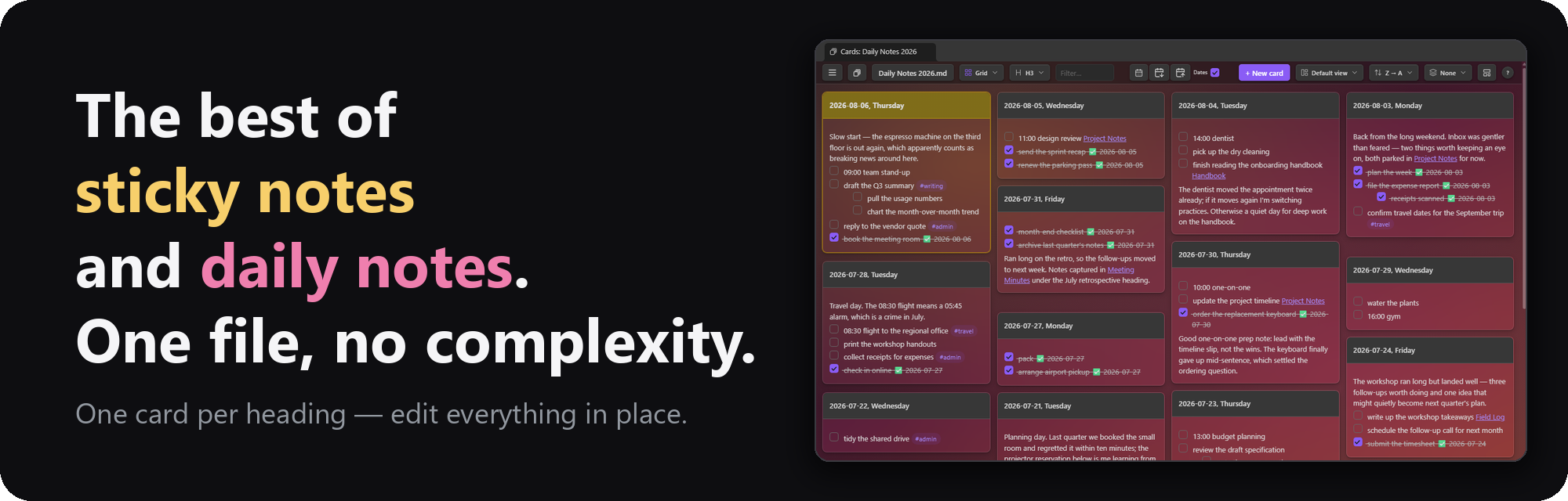
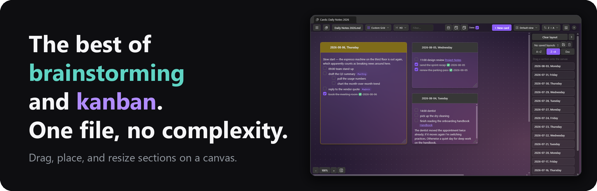
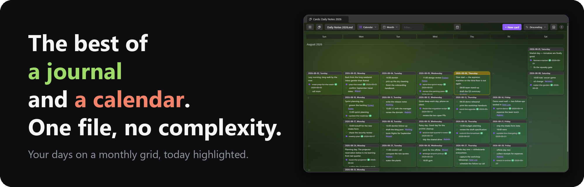
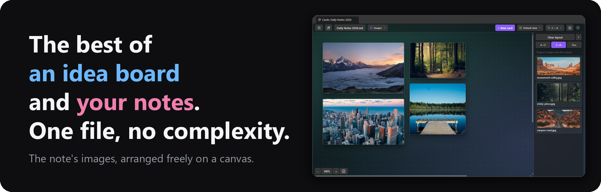
An Obsidian plugin that shows the sections of one note as a wall of cards — one card per heading — and lets you edit any section in place. With many layout and view options, it functions as a home for ad hoc dashboards, a day planner, sticky notes, flash cards, task management, brainstorming, and a diary or journal.
Why one big note? A single file has real advantages over a folder of small ones: an AI agent can read the whole context in one go, nothing about the structure is locked into a plugin, and any app that edits Markdown can edit it. The usual price is excessive scrolling. This plugin removes that price: the note stays one plain Markdown file, and you work in the view that fits the job — a wall of cards, a calendar, a day planner, a canvas — landing on the section you want without scrolling for it.
While this is a standalone plugin that works on any note, it pairs nicely with Single File Daily Notes as well as Tasks.
Install it from the Obsidian community plugin directory → · Release notes
If this plugin is useful to you, you can support its development:
- New note wizard. ☰ → Note → New note… makes a blank note, or one shaped as a Kanban
board, a SWOT analysis, an Eisenhower matrix, or a GTD system — or on the headings of any note
in the vault, its text left behind. Section names are editable, an Introduction and Additional notes are a toggle each,
and a one-line hint can sit under every heading. Any note with
cards-preset: truein its properties joins the list as a preset of your own (see Templates). - Saved layouts. Name a Custom Grid arrangement — placements, zoom, and the note's background — and switch between the note's saved layouts from the tray, the toolbar's Layout picker, or the New note wizard. A changed layout wears an asterisk and asks before it's lost (see Custom Grid).
- Many user interface improvements.
- One card per heading. Pick which level becomes a card (H1–H6). Multiple layouts, sort orders, and per-card colors.
- Work directly on the cards. Click a card to edit its body (the heading stays in the title bar). Rename cards, tick task checkboxes, delete cards, pin to top.
- Drag and drop. Reorder cards, or drag a task, paragraph, or image onto another card.
- Select many. Click a title bar to select its card, Shift-click to select multiple cards.
- Group by. Divider bars over buckets — first tag, date, open tasks, stars, or length — from the toolbar's Group picker. Collapse any card to its title bar; both are remembered.
- Plays with the Tasks plugin. Ticking a checkbox uses its toggle (recurring tasks recur), and the right-click menu gains its create/edit dialogs.
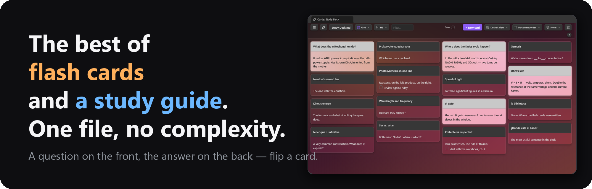
- Flash cards. A marker line splits a section into a front and a back; the card's flip button turns it over to the answer, definition, or notes behind (see Card Flip).
- Make it yours. Apply custom card colors and background images.
- Arrange freely, and keep the arrangements. The Custom Grid canvas places sections where you drop them; save an arrangement under a name and switch between saved layouts at will.
- Calendar feeds. Give a note a calendar's iCal (.ics) address — Google, Outlook, iCloud — and a day's events fill that day's card under a heading of your choosing: one day from its card, or every day at once, making cards for the calendar's days the note doesn't have yet (see Calendar feeds).
- Templates. New cards can start from a template note, and new notes from the New note wizard's built-in structures, your preset notes, or the headings of any note.
- Deck. The toolbar's deck button (or
D) flips the view to thumbnails of your pinned and most recent card notes, each wearing its note's background — click one to hop over.
Pick a layout from the toolbar's Layout button beside the note's name — it opens a grid
of every layout, an icon and name each — from the Layouts row of the toolbar's ☰ menu or
any right-click menu, or press L to cycle (Shift+L backwards). Card level, View mode, Sort, and
Group are the same kind of button: an icon, the current choice, and a grid of icon tiles to
pick from. Layouts you never use
in a note can be hidden from it: Ctrl/⌘-click one in the Layouts menu and it leaves that
note's dropdown and L cycle, staying in the menu dimmed as "(hidden)" — click it there to
bring it back (remembered per note; the layout showing can't be hidden — switch away first).
Full-height cards side by side.

A freeform canvas: drag sections on from the tray, then place, move, and resize them. The arrangement is remembered per note in the plugin's data — never in your notes. The chevron beside Clear layout folds the tray to a slim bar so the canvas takes almost the whole pane; a click on that bar, the panel button in the zoom controls (bottom-left), or ☰ → Show the list beside the canvas brings it back. The Images and Links canvases fold the same way. Saved layouts (the row beneath) name the current arrangement — placements, zoom, and the note's background — so a note can switch between, say, a "SWOT" grid and a "Timeline" strip; pick one from the dropdown to apply it, save again under the same name to update it. Once the canvas drifts from the applied layout its name wears an asterisk, and clearing the canvas, switching layouts, or leaving the Custom Grid first asks whether to save. Saved layouts also appear as tiles in the toolbar's Layout picker, after the layouts, so one is a click away from any layout; and the New note wizard offers a template note's saved layouts, so a note made from a template can open on one of them.

The same canvas for the note's images and videos — a reference or idea board built from what the note already links. Hover a preview to magnify it or open the original; right-click to copy, cut, delete, or paste.

Masonry columns: every card takes only the height it needs.

A uniform grid — every row starts at the same height, with a rule between rows.

The same masonry packing, denser: narrower columns, smaller gaps and type.

Each card shows only its task lines, ordered by date, #tag, or task count, with an
open/done filter and a per-card count badge. Editing still opens the section's full text.

One card per row, full pane width.

One card at a time, filling the pane, with every card's title as a tab across the top — the
strip grows to more rows as titles pile up, and past four it scrolls sideways. Click a tab (or
press , / .) to turn to that card, drag a tab onto another to move its section there in the
note, or drag a paragraph or task from the card onto a tab to send it to that card.

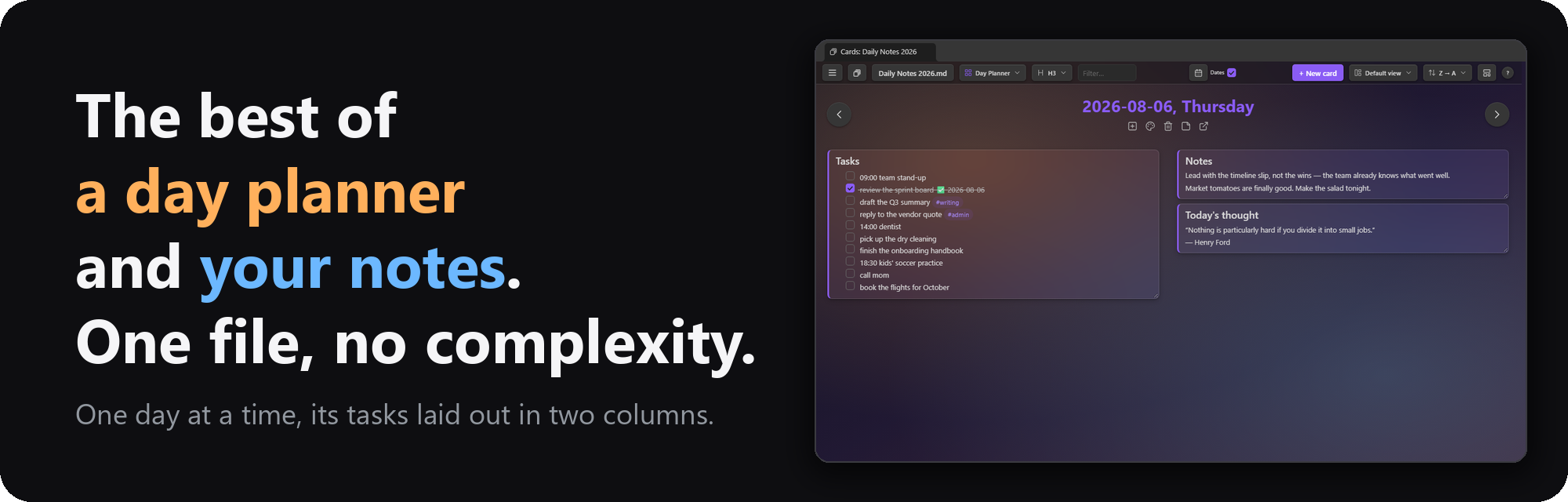
One day on one page: the card's title sits across the top with arrows to yesterday and tomorrow, and each sub-heading directly beneath it is a card of its own in one of two columns, its tasks and any deeper headings inside (a month shows its weeks, each week its days); loose lines above the first sub-heading form one card, named after the unfiled card. Drag a card to the other column or into a new order, resize it, tick its tasks, or send it to the next day by dropping it on an arrow — the note changes underneath, and the arrangement is remembered per note. Right-click a card for its column, height, edit, and copy options, or Delete card to remove that sub-heading and everything beneath it. Stepping onto a day with no card offers to create it or to skip to the nearest day that has one.

☰ → Document setup… says what each heading level of the note holds: nothing, text in document order, text in alphanumeric order, or a year, month, week, or day. With the toolbar's Dates checkbox on, the defaults are detected from the headings themselves (“September 2026” at H1 is a month in the “MMMM YYYY” spelling, ISO days at H3 are days); with it off every level is text. The Day Planner's arrows follow the setup: at a month level → is the next month and ← the one before, a missing month can be created on the spot, and at an alphanumeric level the arrows walk the sections A→Z (numbers by value). Saved per note; Reset to detected forgets the saved rows.
Date cards on a calendar grid, today highlighted — the layout opens on today, with today's cell ringed even when it has no card yet. Click an empty day to start its card, or drag a card onto another day to move it. Needs date headings.
A range picker in the toolbar says how much of the calendar one screen holds: a month,
two weeks, a week, or a day — or press M, 2, W or D while the Calendar is showing
(C switches to the Calendar from any layout), or pick one under Layouts → Calendar in the
☰ or any right-click menu, which switches to the Calendar in that range. The range is remembered per note. Month and
2 weeks shrink their cards to fit their narrow day cells; Week and Day read at the ordinary
card size.
Month — every month between the first and last dated card, scrolling, under a pinned row of weekday names. The sort control orders the months.

Week — one week in the shape of a paper planner: the five weekdays across the top, the weekend lying along the bottom in a band of its own, all of it filling the pane so a day's card shows most of itself rather than a corner. Both runs keep the week's own order, so a Sunday-first week has its weekend bracketing the weekdays rather than trailing them.

2 weeks — that planner twice, side by side: all ten weekdays across the top, each week's weekend in the band beneath it, and a rule down the middle between the two weeks. Its arrows step one week at a time, so the week you were looking at stays on screen — it just moves to the other side.

Day — one day, filling the pane. It edits on click like a card in any other layout, where a cell in the other ranges opens big first.

2 weeks, Week and Day carry a row of arrows: ‹ and › walk a week (or, for Day, a day) at a
time — as do the , and . keys — and Today comes back once you've wandered off. They
walk past the note's dated days too: that's how a day the note has never mentioned gets its
card.
A year-at-a-glance graph of the dated cards, shaded by tasks done, with streak stats above. Click a day to open (or create) its card. Needs date headings.

The canvas for the note's web links: placed tiles show a live page preview. The magnifier opens the page big and interactive; ↗ opens it in your browser.

The toolbar's View mode toggle groups cards by the headings above the card level, in any
layout except the Custom Grid canvas. Hierarchy adds drill-down columns on the left — click
a heading to see its branch, with card and open-task counts per row. Dividers keeps one
wall, split by a collapsible bar per ancestor heading; the count at the bar's right end shows
the group's size. In either mode, , and . step to the previous/next heading — switching the
selected column row in Hierarchy, scrolling the previous/next bar to the top in Dividers.


The plugin works reasonably well on iOS devices, though it isn't fully tested there yet. The Horizontal layout in particular makes an excellent way to input data while on the go: one full-width card per section, with quick add, checkboxes, and in-place editing a thumb-tap away.

The toolbar's Group dropdown puts divider bars over buckets of cards instead of the ancestor
headings: Tag (a card's first #tag), Date (the heading's date, else the latest date in
the body — Upcoming, Today, Yesterday, This week, This month, Older), Open tasks (6+, 3–5,
1–2, none), Stars, or Length (long, medium, short). Cards keep the active sort inside a
bucket; click a bar to collapse its bucket. The choice is remembered per note, like the sort.
Selection works like a file manager: click a card's title bar to select it, Shift-click another
card to select the run between them, Ctrl/⌘+A for every visible card, and click empty space (or
press Esc) to clear. Ctrl/⌘-click makes a card big instead.
Changing the sort or grouping keeps the selected card in view. A bar along the bottom then offers Pin, Unpin,
Color…, Flip / Unflip (two-faced cards), Rename card… (rewrites the heading text; pins, colors, and placements follow), and Delete…; a title bar's right-click menu
has the same, plus Move selected before / after this card. Dragging one selected card drags
them all (document order). Esc clears the selection.
Keyboard. The arrow keys move a dashed focus ring to the nearest card in that direction;
Enter opens that card's editor, Space selects or deselects it, and Shift+arrow extends the
selection as it moves. In the Rolodex and the Day Planner, left and right step to the
neighbouring card; on the Calendar's 2 weeks, Week and Day ranges, , and . walk the calendar.
Hovering a card's title bar reveals its buttons just beneath it — quick add, update from the calendar feed (on a dated card, when the note has a feed), color, delete, make big, sticky, open in the note, and flip. They sit over the body's first line, so the strip ends with an arrow that sends it to the card's bottom edge instead (and back again), leaving the first line free to read and click. The move lasts while the note is open.
The chevron in a title bar's action strip (or Collapse card in its right-click menu) folds a card to its title bar; click again to open it. Collapsed cards are remembered per note.
A single note makes a whole brainstorm: one ### heading per theme, and the wall becomes your
sticky notes (sample-vault/Brainstorm.md is this example).

Then switch to Custom Grid and arrange: cluster related themes, size cards by importance, and leave the "later" cards in the list on the right. Drag tasks between cards.

Right-click a task or paragraph on a card (long-press on mobile) for a menu.

- Move line to previous / next card — sends the block to the neighbouring card in the current sort order
- Move line to today — on a dated note, sends the block to today's card, creating it first if the note doesn't have one yet
- Edit line… — opens the block in a small edit window, in the same live-preview (or source/plain) editor mode cards use; double-clicking the line opens it too
- Mark done / Mark undone — ticks or unticks the task where it sits
- Copy / Cut line — puts the block on the clipboard; Cut also removes it from the section
- Paste below — inserts the clipboard contents after the block (from a card's empty space, Paste at end appends to the card instead)
- Add star / Remove star — marks the line with the star emoji, for the toolbar's starred-only view (see Filter and starred lines)
- Delete line — removes the block (and sub-items) from the section
When Tasks is installed and enabled, the integration switches on by itself:
- Ticking a checkbox goes through Tasks, so recurring tasks spawn their next occurrence and done dates follow your Tasks settings. (The "Toggle tasks with the Tasks plugin" setting, on by default.)
- Edit task (Tasks)… — the right-click menu opens a task in Tasks' edit dialog (via a normal editor, since Tasks edits at a cursor).
- New task (below) (Tasks)… — Tasks' create dialog, inserting the finished line below the clicked block, or at the section's end from a card's empty space.
Without Tasks, the menu omits those entries and this plugin's own toggle applies — with the
optional ✅ YYYY-MM-DD done date.
Ctrl/⌘+T in a card editor opens the Tasks plugin's dialog for the task on the cursor line, or creates a new task there — the same as Tasks' own Create or edit task command. (The plain-text editor has no cursor for Tasks to read, so it gets the create dialog and the line drops in at the cursor.)
Due-task marks (settings → Tasks → Mark cards with due tasks, on by default): a card with an
open task due today gets an amber pill and edge; one with an overdue task, red. Both Tasks-style
📅 2026-09-10 dates and Dataview [due:: 2026-09-10] fields count.
Every card's title bar has a pin button (click again to unpin). Pinning pulls the card into a pinned section at the top of the wall regardless of sort order, remembered per note across layouts, views, and restarts.
Filter and starred lines
Scan report · 2026-09-27
- ✓ Prohibited terms or links
- ✓ Repository eligibility
- ✓ slopscore.md paperwork
- ✓ Content policy
- ✓ Risk review — +10 owner has 0 followers
From the balcony · 0 of 3 clapped
Schnitzel, Cap'm Slop and Princess read it and passed. Their reasons are on the balcony, with every other verdict.
Critics are accounts on this site with no GitHub account behind them. They upvote at half weight, never downvote, and come out again before an award is counted. Who they are.
0 comments
log in to comment.